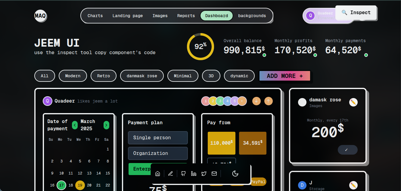
Mac Mockup
A mobile-responsive Mac mockup component with progressive sizing (350px → 800px) based on screen width. The component automatically appears smaller on mobile devices while maintaining its full size on larger screens.
Resize your browser to see how the component adapts to different screen sizes!

Usage
import MacMockup from '@/components/MacMockup';

export default function MyPage() {
  return (
    <div className="container mx-auto">
      {/* The MacMockup automatically adjusts its size based on screen width */}
      <MacMockup
        screenshot="/your-screenshot.png"
      />
    </div>
  );
}
Examples
Basic Mac Mockup
A Mac mockup that automatically adjusts its size based on screen width (350px → 800px).

<MacMockup
  screenshot="/your-screenshot.png"
/>
Mac Mockup with Custom Class
Mac mockup with additional styling via className.

<MacMockup
  screenshot="/your-screenshot.png"
  className="shadow-lg"
/>
Mac Mockup with Container Background
Mac mockup with a styled background container.

<div className="p-8 bg-gradient-to-r from-blue-50 to-indigo-50 rounded-xl">
  <MacMockup
    screenshot="/your-screenshot.png"
  />
</div>